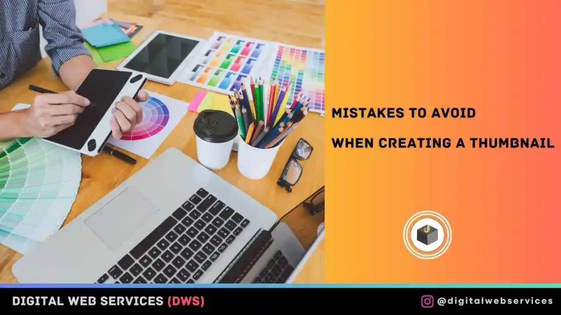
Knowing the right thumbnail maker is not enough to give you a good thumbnail. There are dos and donts binding different practices. Creating a thumbnail has its rules as well. Some of the practices around these have been spotted as mistakes and should be avoided to drive home the purpose of a thumbnail.
Common Mistakes To Avoid
Regardless of the type of thumbnail creator you use, there are certain mistakes you must not make. In the rest of this article, we will highlight some of the mistakes you should avoid when creating a thumbnail.
Using a wrong size
YouTube thumbnails should be at least 640 pixels wide and 1280 pixels high. Making thumbnails that are too tiny is a mistake; instead, it is preferable to create a larger picture that can be shrunk. Other things you should also think about include:
- thumbnail’s aspect ratio;
- file size;
- file type.
Ensure you are not using a wrong size YouTube thumbnail.
Poor contrast ratio
Your thumbnail serves as a presentation for your brand. You must not design it shabbily. At the same time you must not stuff it with many elements like fonts and colors. Simple is better.
No context
A top-notch picture that is pertinent to the context of your film serves as a preview of what viewers will get after viewing. Please make sure that your thumbnail sets the scene and aids users in understanding what they may expect within. A thumbnail’s pertinent title text would be the ideal technique to provide context.
No Title Text Or Wrong font
To make it easier for viewers to grasp what is happening in the video, provide thumbnails and title text. To encourage visitors to click and watch your video, utilize energetic verbs and evocative words.
No Brand Identity
What distinguishes your brand from others and aids the target audience in doing so? To ensure that viewers “grab” your films at a glance, brand your thumbnails in accordance with your personality. Think about using the same fonts, colors, and visuals that you use on your website, social network pages, landing pages, and other marketing platforms.
Using baits
When creating YouTube thumbnails, be truthful and precise. Your brand’s reputation and rankings will suffer if you utilize click bait and deceive consumers. Your bounce rate will rise when viewers abandon your channel after seeing unrelated information. It will serve as a warning to YouTube to cease displaying your videos in relevant search results.
Inconsistency
Utilizing the same layouts, color schemes, typefaces, and other pertinent elements when designing YouTube thumbnails for your business is known as consistency. Being consistent identifies you as a professional who values your audience and material. It aids viewers in comprehending the gist of your films, imagining the persona of your company, and catching your tone of voice.
For improved usability, stick with one typeface for headings, up to three colors, and the color-contrast ratio. Always provide information and a headline text in your thumbnail; stay away from clickbait. Keep your thumbnails simple by not using too many colors, fonts, images, or other features. Stick to the recommended size for YouTube thumbnails.
Conclusion
Designing your channel’s YouTube thumbnails is essential for attracting viewers and building brand recognition. You may affect the exposure and rankings of your personal or promotional films on YouTube by appropriately optimizing their thumbnails.

Digital Web Services (DWS) is a leading IT company specializing in Software Development, Web Application Development, Website Designing, and Digital Marketing. Here are providing all kinds of services and solutions for the digital transformation of any business and website.